Page 1 of 1
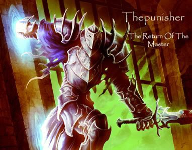
THIS IS THE REAL ONE!!!!!

Posted:
July 11th, 2007, 2:15 amby thepunisher

Posted:
July 11th, 2007, 9:31 amby Tarathilien
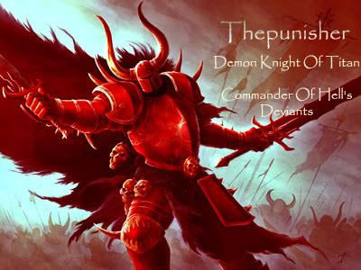
The middle one R-O-C-K-S, dude. I voted for that one!!


Posted:
July 11th, 2007, 9:39 amby Joe
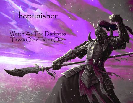
ok, technically, I think you could remove one of the "takes over" from the top one, but it's still the best either way.

Posted:
July 11th, 2007, 12:20 pmby thepunisher
oops i dont know what happened there i will do that this second!
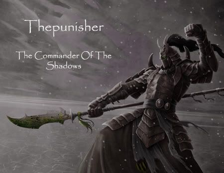
well it ended up not letting me so i just made a new one. this one is being added.

I like it. i gave hime a greyish shadow armor with some hint of color etching in it, the orc blood on his weapon, and the green glowing eye.

Posted:
July 11th, 2007, 3:00 pmby Ominous
That one. The one you just posted, there. That is 73h w1nz0rz.

Posted:
July 11th, 2007, 3:16 pmby thepunisher
i agree i like it

Posted:
August 3rd, 2007, 9:35 amby ac_shadow
also voted for the first one

Posted:
August 3rd, 2007, 2:01 pmby Agustus
take out one of the "The"s its too much
should read commander of the shadows
otherwise it makes it sound like your the only commander of the shadows

Posted:
August 3rd, 2007, 2:16 pmby Cheshire
Here's a trick that I use:
Change the color of the text so that it matches the color pallet better (say, a shade of gray that is similar to a gray on the armor). Then apply a very subtle outer glow around the text (white or even lighter shade of gray than the text). This will trick the eye into thinking everything is "color coordinated" yet will make the text stand out.
In fact, I used this trick on my current siggy. If you look at the bottom right hand corner, my name is simply outlines of the letters (with the luminous effect i think). But the way I made it stand out while keeping the contrast/colors the same is by applying a outer glow (notice the sand around the letters is slightly lighter than the sand a little further away).
